
It’s easy to get distracted on the Web. It happens to all of us.
If you are a business owner looking to get the most out of your digital presence read on.
Your Web site is currently under siege. Web audiences are reading less and less these days, jumping from site to site rarely engaging beyond a couple mouse clicks. In this fragmented digital media landscape grabbing your audience’s attention has never been more challenging.
 The Web, once the domain of simple utilitarian sites comprised predominantly of text and few images, has evolved into a rich, distraction-inducing feast for the senses. Motion-graphics, banner advertisements and streaming videos have become staples of the modern Web experience. Click Here! Like this! Pin It! Retweet This Article! The Web is full of interactive forks in the road all vying for a piece of the screen and, significantly, a shrinking slice of the audience’s attention.
Through proper planning, design, and sound technical execution, your digital presence can shine and differentiate what’s unique about your business’s products and services to hyperactive Web audiences.
I will touch upon 2 core design elements that, if properly addressed, will enhance your Web site’s overall user experience, and set the stage for longer visits and stronger audience interactions.
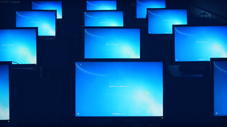
Design Principle #1: Scale and Proportion
As desktop screens get larger and larger in terms of resolution –that’s the number of viewable pixels in the horizontal and vertical plane–modern Web user interfaces should take full advantage of this additional screen real estate.
An aging Web site built a mere 5 years ago will usually stick out like a sore thumb occupying just a small portion of the available browser area. In these cases the site in question may have been optimized for 1024-by-768 pixel displays, the dominant screen resolution 5+ years ago. Text will likely appear miniscule and will be difficult to read and images and important elements governing the site’s function (e.g. menu items, text input fields on contact forms) will lose their effectiveness visually and in terms of usability.
In the same way a Web site that hasn’t been optimized for mobile forces users to jump through hoops to get things done, so too an antiquated site designed for 1024-by-768 pixel displays can undermine audience engagement.
Fundamentally these issues can be resolved by using the entire Web browser. A modern Web site should strike a strong visual presence in the browser. That means large, bold headlines, expansive (but not distracting) imagery, big, easy to scan text; and clear, visually intuitive menus and calls-to-action that draw audiences inside to explore more of your site’s content.
Design Principle #2: Minimalism
Clutter is distracting. Busy looking Web pages encourage visitors to move quickly through pages rather than read through information. Limiting the number of competing graphical elements on any given page and visually prioritizing core messages can help your audience to focus on the content that is most important.
Many poorly designed Web sites barrage users with successive arrays of gratuitous and often irrelevant graphical callouts and Ads. Loading down your site’s pages with ineffective visuals may in fact have the opposite effect and drive people away.
Clean and simple always wins the day in the modern digital space. A great Web site experience starts with pairing down the competing messages and limiting unnecessary graphical embellishments, particularly around the outer perimeters of a Web layout –sidebar columns, header and footer area.
Similarly, reducing the amount of copy while increasing the size of body text greatly reduces the overall cognitive effort required to absorb information.
…
Thoughtful design and content are the basis of successful user experiences on the Web. Limiting user distractions through proper planning and technical execution helps your target audience focus on your content and perform important tasks like finding your address and contact information. Consequently one of the best ways to ensure your site breaks through the clutter on the Web.
Image credit: Coyoty