Happily for all of us interested in design, digital trends and techniques never stay static. There’s always something new – whether it’s a completely original visual approach or a rethink of a print design technique for web. Closing out my series on techniques and trends that made us all sit up and take notice in 2013, I have to say that for a copywriter the research has been both fun, informative and inspiring! Well done, digital designers! If you haven’t yet, check out Parts 1 and 2.
Flat Design
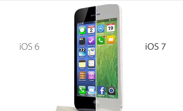
Flat design has taken the Web by storm. It’s replaced skeuomorphism, yesterday’s “it” trend that emphasizes a three-dimensional approach to design that touts real-life resemblance and effects like textures and shadows. Initially popularized by previous versions of Apple’s iOS, flat design has taken over with the emergence of Microsoft’s “Metro” interface and, most recently, Apple’s radically-redesigned iOS7. Flat design emphasizes a simple approach, highlighting usability while doing away with added effects.
Content First
The “content first” technique came about in response to the growing emphasis on content in the digital world. In recent years, it was often considered standard for designers and developers to build a website before adding the content. However, this can create issues down the line and we’ve seen a shift to collecting all of the necessary collateral, such as a copydeck and images, prior to development. This allows the content, the bread and butter of the website, to take centre stage.
Sliding Panels
Dynamic websites are often associated with Flash, an outdated platform commonly used for games, graphics and animations. Fortunately for us, today’s efforts are primarily powered by JavaScript and jQuery, which, considerably more advanced, allow for greater creativity. Sliding panels are a great way to add uniqueness and movement to web pages, which load from left to right (or vice versa). Effects like these can be difficult to display on mobile devices, so tread carefully.
Bold Colours
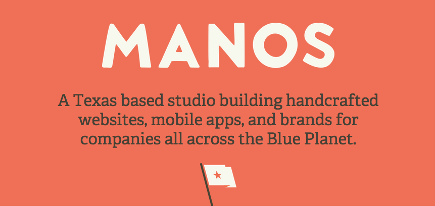
Bold colours are a powerful way to stand out on the Web, and we’ve noticed a lot of them in 2013. The range of acceptable hues has expanded from basic primaries, with an emphasis on blue in many cases, to include much stronger variations like pastels, purples, peach and salmon. This trend looks great when used sparingly – such as a pop of colour on an otherwise muted background, which the company Manos did a great job of.
Moving Images
It’s easier than ever to add effects and animations to web designs and this trend is certainly on the rise. Moving images are a more creative take on traditional static. Movement is a simple way to catch and hold the attention of users and there are many different ways to creatively incorporate it into websites.
These trends and techniques are fascinating examples of just how dynamic web design is today. Flat design, bold colours, sliding webpage panels, content first and moving images are just 5 examples of web design’s continual evolution. At Yabsta Digital, we can’t wait to see what’s in store for 2014.
Image Credits: Enfuzed & Manos
Happily for all of us interested in design, digital trends and techniques never stay static. There’s always something new – whether it’s a completely original visual approach or a rethink of a print design technique for web. Closing out my series on techniques and trends that made us all sit up and take notice in 2013, I have to say that for a copywriter the research has been both fun, informative and inspiring! Well done, digital designers! If you haven’t yet, check out Parts 1 and 2.
Flat Design
Flat design has taken the Web by storm. It’s replaced skeuomorphism, yesterday’s “it” trend that emphasizes a three-dimensional approach to design that touts real-life resemblance and effects like textures and shadows. Initially popularized by previous versions of Apple’s iOS, flat design has taken over with the emergence of Microsoft’s “Metro” interface and, most recently, Apple’s radically-redesigned iOS7. Flat design emphasizes a simple approach, highlighting usability while doing away with added effects.
Content First
The “content first” technique came about in response to the growing emphasis on content in the digital world. In recent years, it was often considered standard for designers and developers to build a website before adding the content. However, this can create issues down the line and we’ve seen a shift to collecting all of the necessary collateral, such as a copydeck and images, prior to development. This allows the content, the bread and butter of the website, to take centre stage.
Sliding Panels
Dynamic websites are often associated with Flash, an outdated platform commonly used for games, graphics and animations. Fortunately for us, today’s efforts are primarily powered by JavaScript and jQuery, which, considerably more advanced, allow for greater creativity. Sliding panels are a great way to add uniqueness and movement to web pages, which load from left to right (or vice versa). Effects like these can be difficult to display on mobile devices, so tread carefully.
Bold Colours
Bold colours are a powerful way to stand out on the Web, and we’ve noticed a lot of them in 2013. The range of acceptable hues has expanded from basic primaries, with an emphasis on blue in many cases, to include much stronger variations like pastels, purples, peach and salmon. This trend looks great when used sparingly – such as a pop of colour on an otherwise muted background, which the company Manos did a great job of.
Moving Images
It’s easier than ever to add effects and animations to web designs and this trend is certainly on the rise. Moving images are a more creative take on traditional static. Movement is a simple way to catch and hold the attention of users and there are many different ways to creatively incorporate it into websites.
These trends and techniques are fascinating examples of just how dynamic web design is today. Flat design, bold colours, sliding webpage panels, content first and moving images are just 5 examples of web design’s continual evolution. At Yabsta Digital, we can’t wait to see what’s in store for 2014.
Image Credits: Enfuzed & Manos
